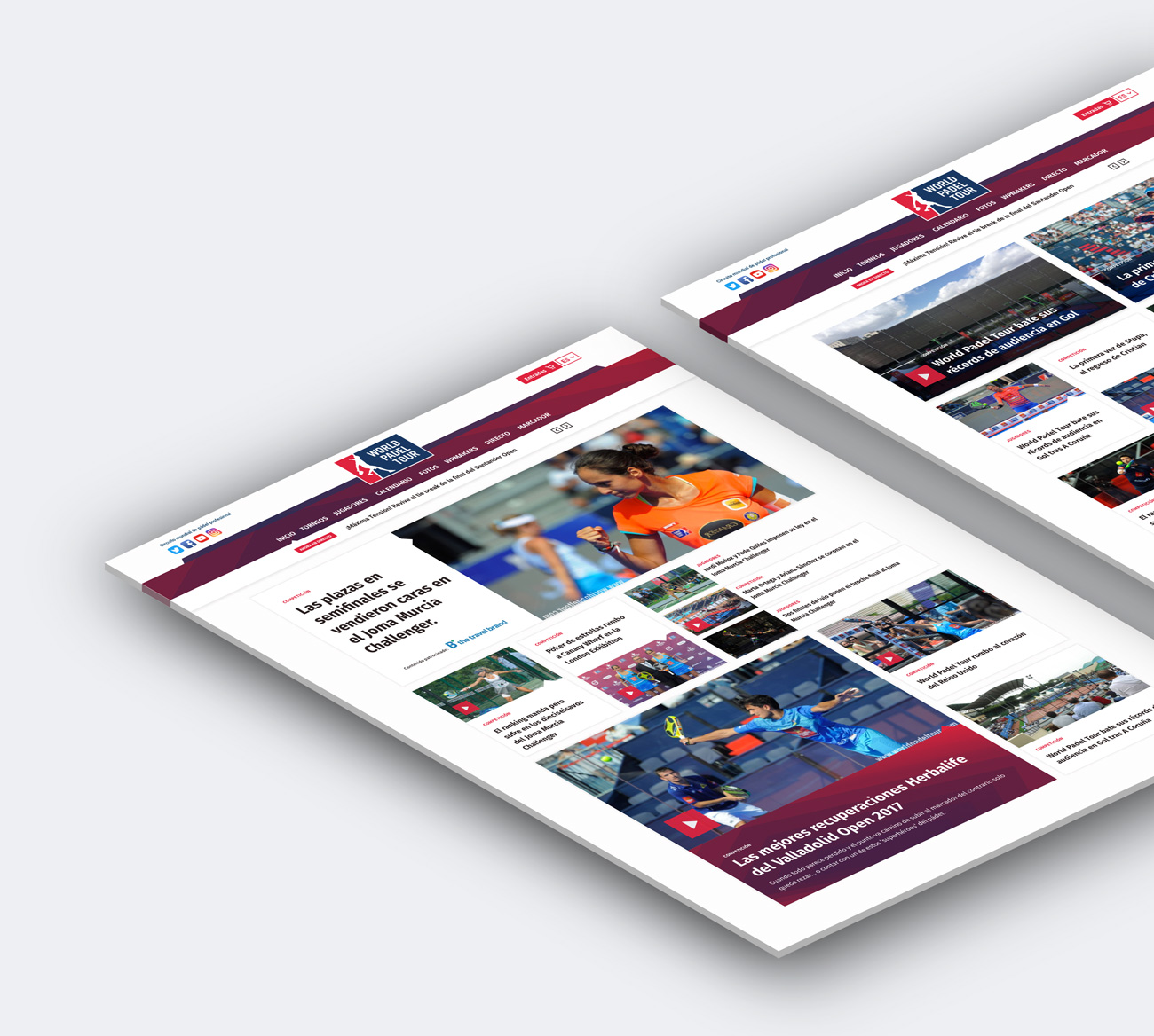
Creative direction, design and front-end development for the World Padel Tour. For this project we joined forces with our friends from Weprot in charged of the back-end. World Padel Tour is the world professional padel circuit, they manage to entertain players as well as the audience and create a fascinating and competitive environment within the sports industry. We were in charged of the complete redesign of their website, whereby one of the primary goals was to make it easy for the journalists and the media team to be able to configure the main page with new layouts everyday so that the news, videos and photos can be highlighted as per their needs and the entire page have a new fresh look everytime a user enters the site.
GOALS
Create a very intuitive news site, with a easy to follow navigation system and information flow for both audience and players.
WPT needs
CREATE
A well balance home page through a modular and organized systems that can be managed easily internally.
Our strategy
CONFIGURE
A puzzle like system whereby every module is part of a whole at the same time it allows different contents as per the brand requirements and commercial interest.
WPT needs
BRING TOGETHER
the best worl padel and the audience.
Our strategy
HUMANIZE
Every section of the site so that it fosters a positive and intuitive user experience.
OUTCOME
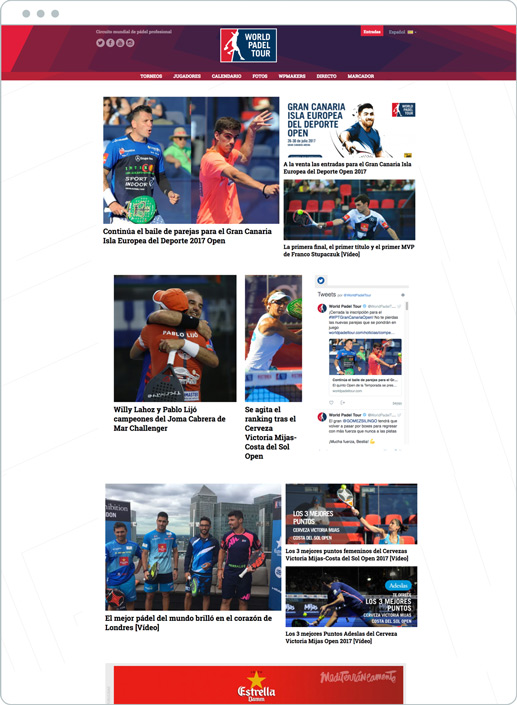
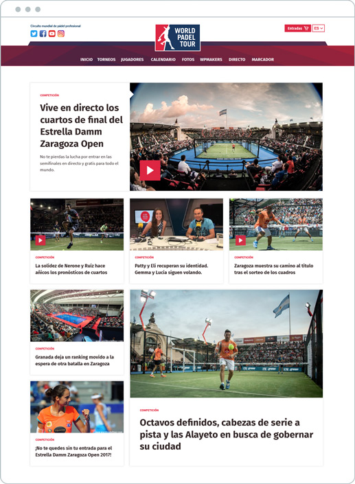
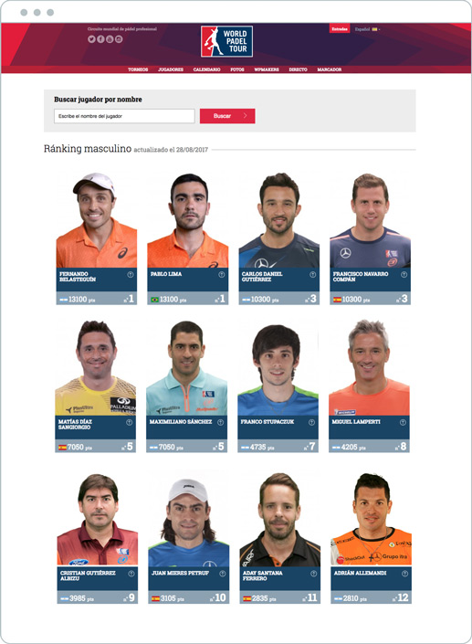
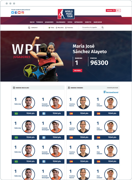
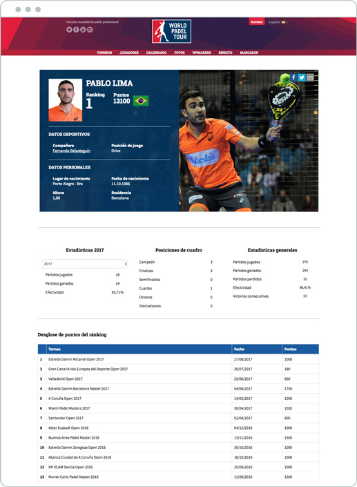
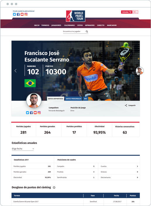
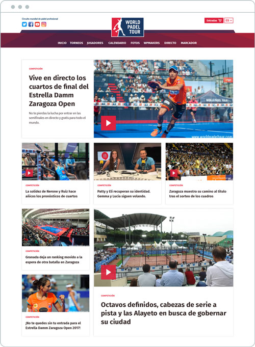
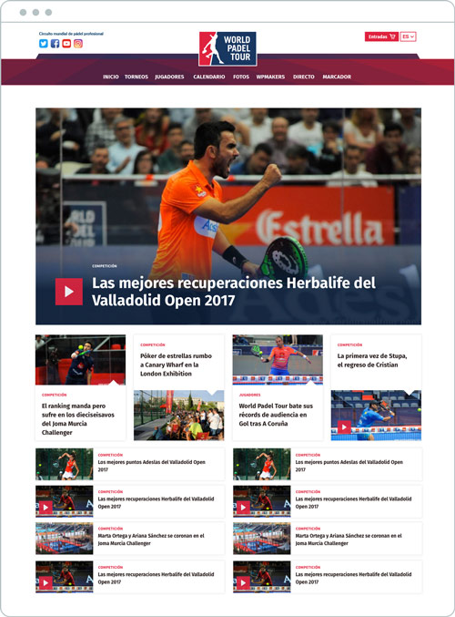
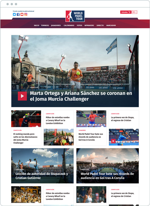
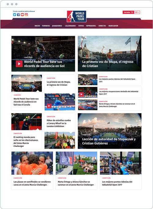
The following images showcase the outcome in terms of design layout and UX with a before and after comparison.
BEFORE – AFTER
BEFORE – AFTER
BEFORE – AFTER
BEFORE – AFTER
THE PROCESS
Our focus
For the homepage we started off with an analysis of the aspect ratio, gutter, grid and different screen sizes. Created a very basic prototype and tested it to make sure every module was fitting as planned which also gave us further insight for development.
Hierarchy system
Created a “card sorting” system where each card contains a single story, as well as the different contents World Padel Tour requested, making sure the integrity of the whole modular system was intact. Through these cards and the right information architecture, it helps the user to create mental models and clarity without overstimulating their experience and interaction on the site.
Web style guides
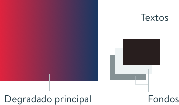
Following the branding guidelines, we carefully adapted their brand elements to the web. Created additional graphics assets using WPT colours with a new fresh look.
Typography
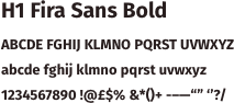
Fira Sans Bold is a kind of Sans Serif font, which stands out for being clean, solid and modern. It also illustrates confidence with some informal accents that generates interest.
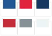
Colours
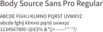
Secondary Typography
This font is a humanist font and it slightly condensed make it a brilliant choice for digital formats.
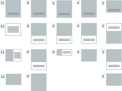
Extreme modularity for the homepage
The final system we created was ideal for their internal communication team, as it allows more than 40 different configurations in the homepage and whereby every module fits like a puzzle in every device.

UI & Elements
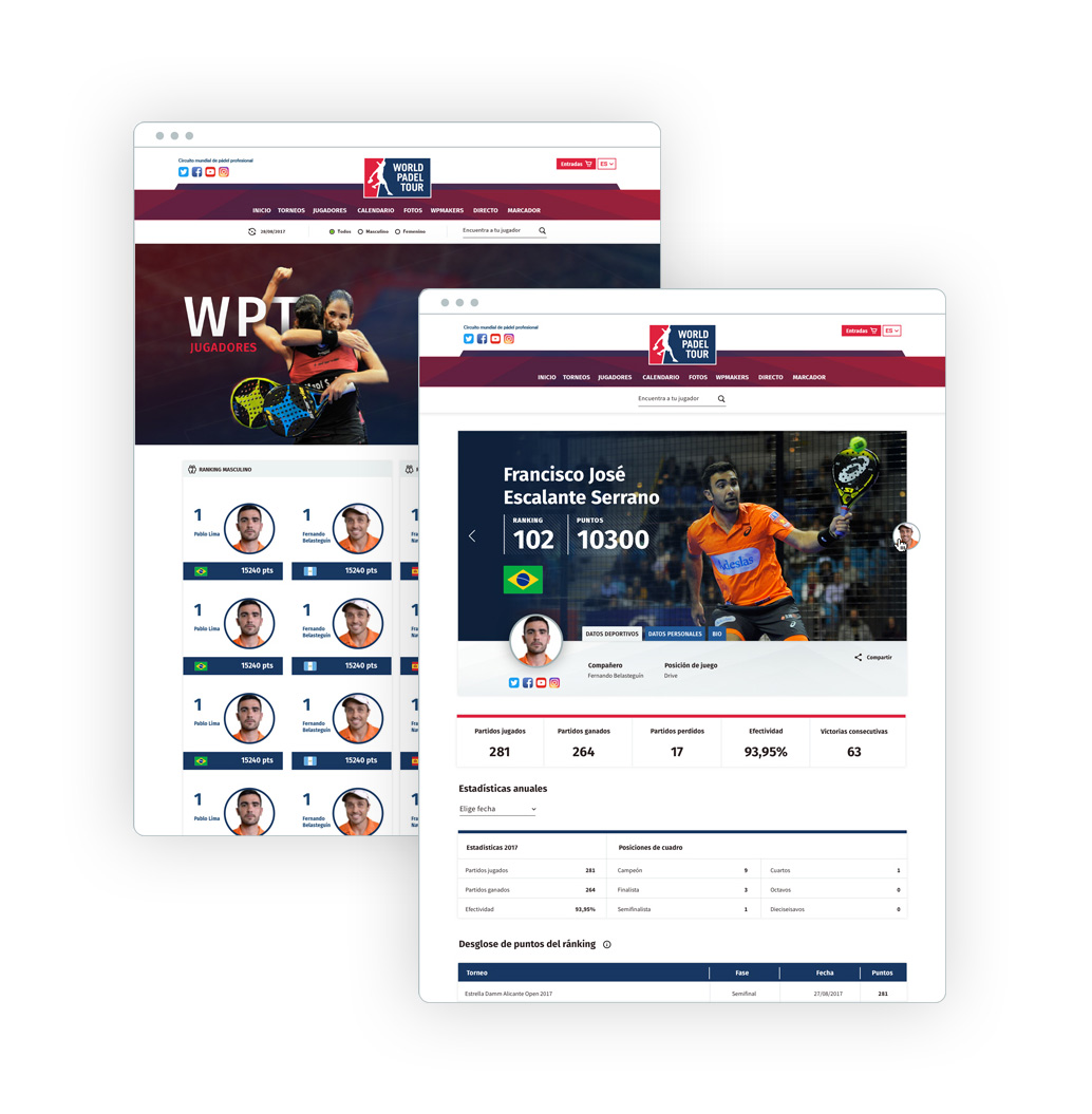
Every module is fit for purpose, attending the specific requirements needed by World Padel Tour, such us max/min number of characters, titles, excerpts, tags and sponsors.
Modules with video and live video
Videos can be played within the modules, so this feature enhances user experience.

Special modules
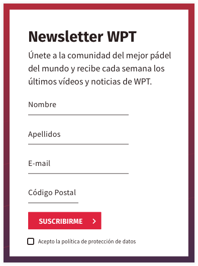
We designed different modules for social media in a way that the user can interact and feel part of the game. Modules showcasing the next tours that are soon going to take place, real time player ranking, galery and a few suscription modules that fits in different ways within the rest of the modules/contents.
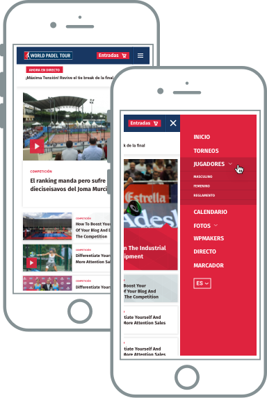
Fluid modules and nav menu.
All modules as well as navigation menu are designed to adap to different screen sizes, so that it creates consistency and fluidity.
Dynamic pages
We developed a filter system and other options that helped to improved the navigation across pages and symplified user actions, thus creating a better user experience.
Pages with many sections and CTA’s
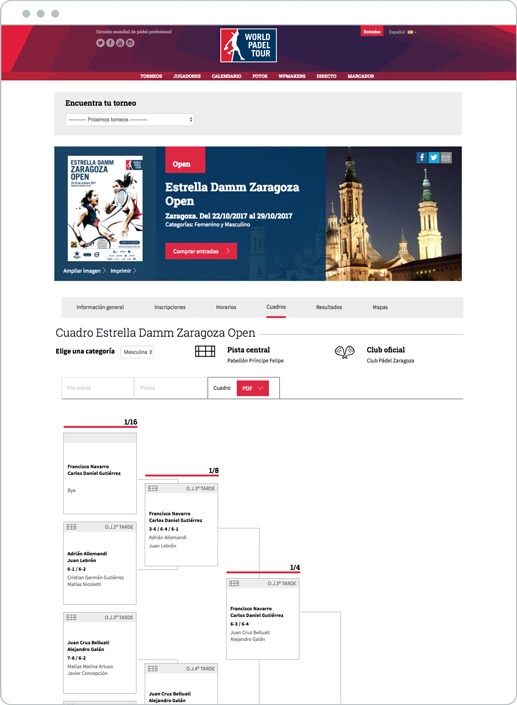
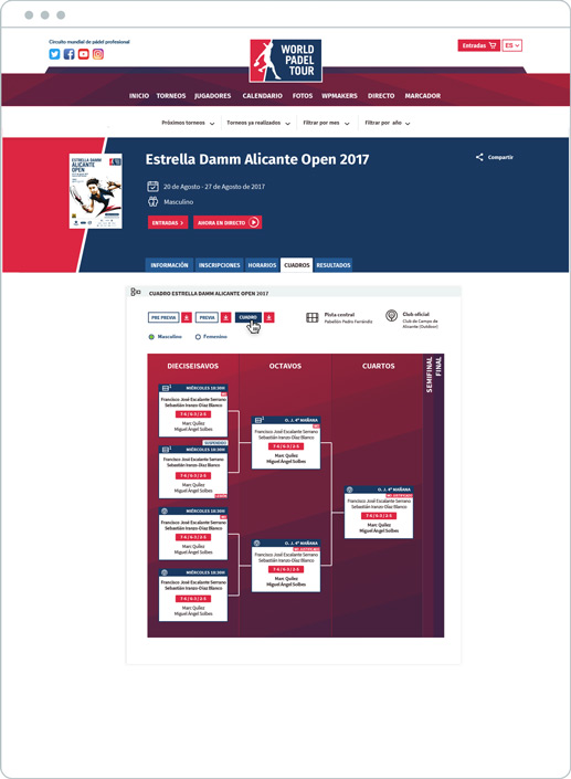
We created a megamenu that only shows and is always visible, on certain pages where this information is needed. We also developed a horizontal, dinamic and interactive accordion for complex contents such as match schedules and player classification on the different phases of a game.
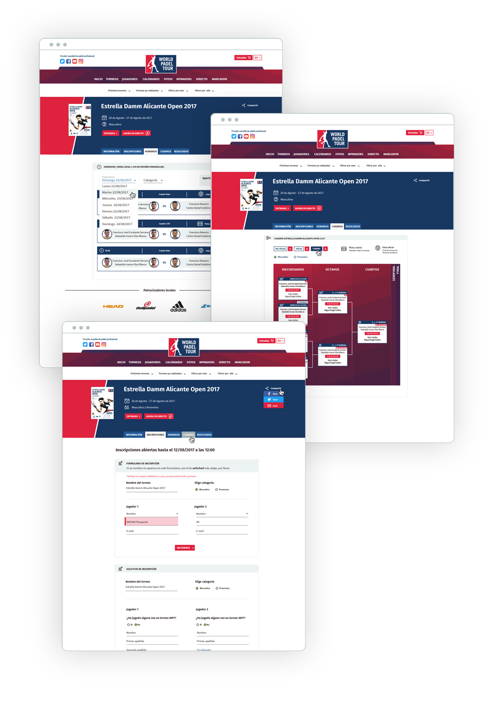
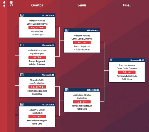
New ways for info visualisation.
The game schedules with the different phases for each tournament was a real challenge. The main goal was to enhance the UX by solving unnecessary scroll. The creative approach was to maintain three match phases opened and restrict the height of the module as per the matches showcased.
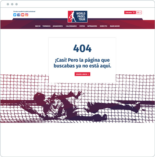
Funny 404 page
A page that makes user less frustated when a page is not found.
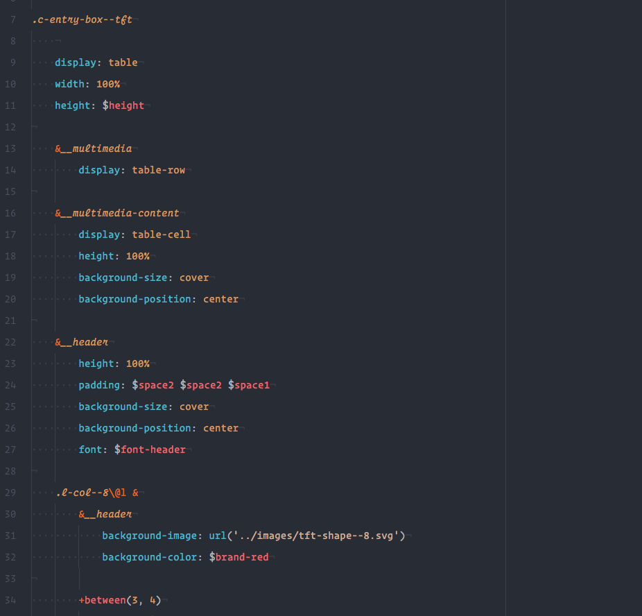
The code, the invisible part of the project.
The Front-end development was based on modularity, scalability and efficiency.
To achieve these goals in terms of styles, we created the code specifically for the unique and modular design and we just used some small SASS libraries. We used BEM techniques with the extension of Harry Roberts and its ITCSS (Inverted Triangle CSS architecture). We also followed ITCSS guides for structuring the folders.
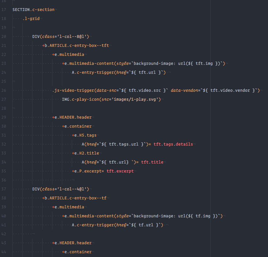
PugJS + BEMTO was key to abstract HTML and and enjoy again its code creation.
The site can reach a million and a half of visits a month, so the efficiency selecting the files and data to render has been key.
Currently the home page is loaded in less than 1 second, having quite a lot of images and videos, we have achieved to keep the weight in ~2MB. Each of the different modules that the home has contain an image adapted to it, at the same time, all the videos load just an image till the user click the play to watch it.
In other pages of the site we have followed the same logic, for elements that are not visible we have used lazy loading or load data just when the user need it.
Final outcome
We are proud to have achieved great results and to continue working with World Padel Tour as their design partners.

What World Padel Tour says
It was a pleasure to work with Brandgestic. We worked on the re-design of the World Padel Tour website and Silvia-Uli not just quickly understood the needs, but also came up with different creative solutions to very complex challenges.
In just four months and with agile methods that allowed to add new requirements and addons not foreseen internally, we launched the complete website sucessfully.
Luís Pinheiro | Digital Project Manager
see website live